
Riley Hopkins
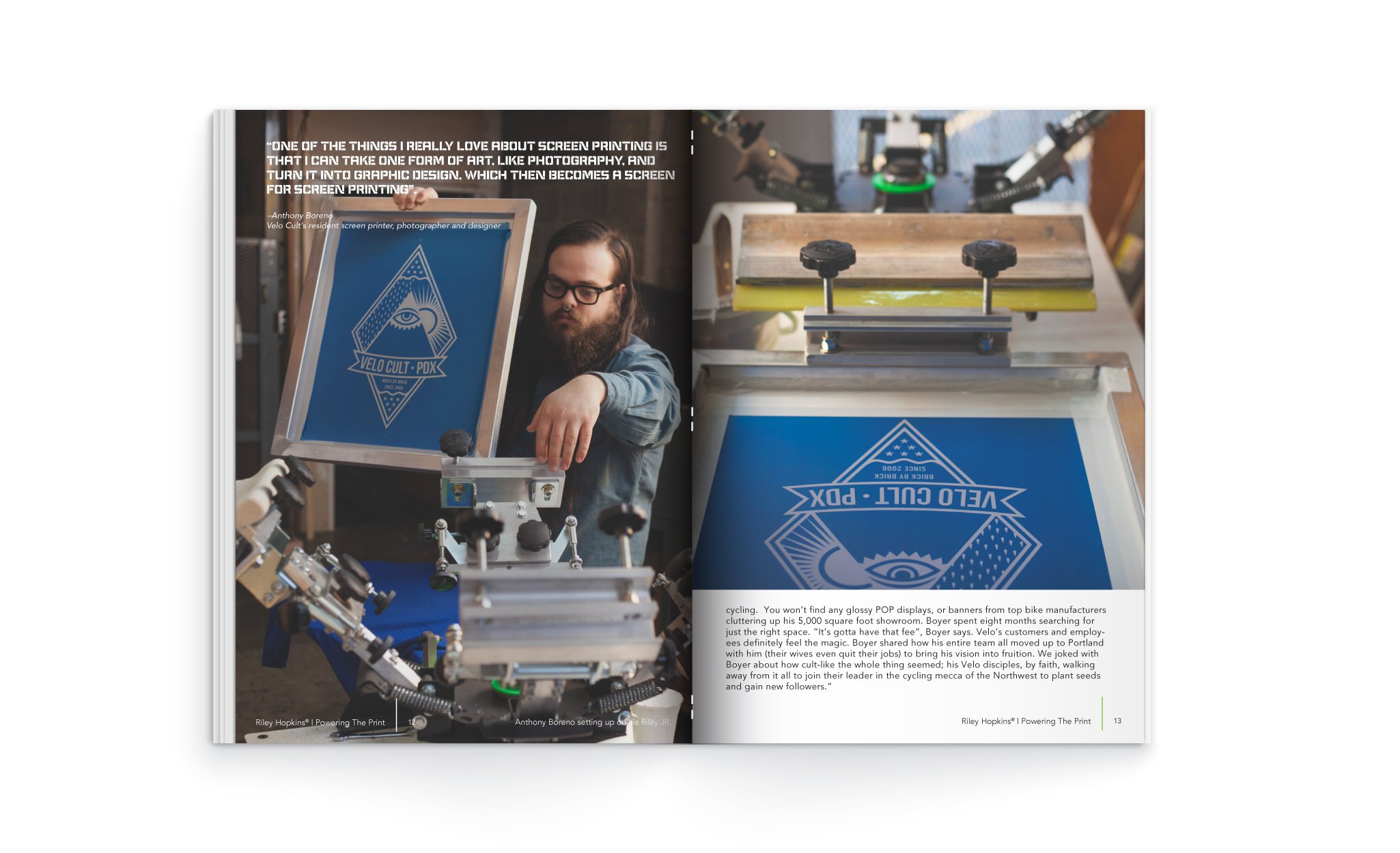
While working with Ryonet® I had the privilege to redesign the Riley Hopkins signature logo and create a company first-of- its kind sales tool; a product catalog featuring a more lifestyle driven-design that included an actual Ryonet® customer profile.
Deliverables: Creative Direction, Concept Creation, Photoshoot Art Direction, Catalog Design, Logo Design.
Lifestyle Photos: Jean-Claude Van Burgundy
Product Photography: Ryonet®


The original Riley Hopkins script logo was based on the signature of the company’s founder, Mr. Riley Hopkins. The original logo was set at an awkward angle and lacked continuity in the letters which presented a challenge when using the logo in layouts and on products. A decision was made to redesign the long-standing logo. The updated logo is now cleaner, more user-friendly and most importantly, it’s still easily recognized as the Riley Hopkins brand.